objectives:
students will understand the art of lomography and its characteristics.
Students will re-create lomographic effects using photoshop.
students will apply various adjustment layers and filters in photoshop.
what is lomography?
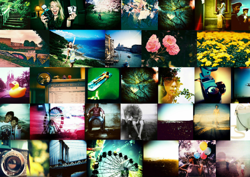
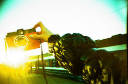
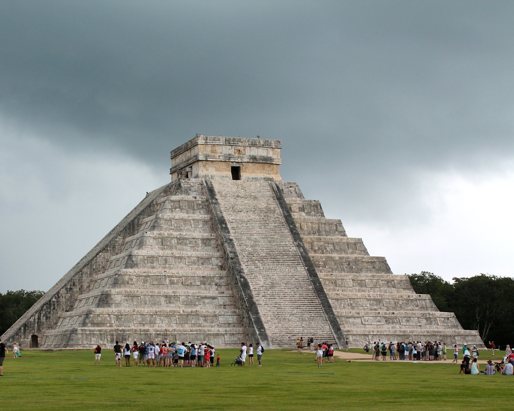
Lomography is a type of analog (film) photography using cheap, plastic, toy cameras such as the Diana, Holga, etc.
It is now a popular movement in photography.
It is now a popular movement in photography.
defining characteristics of "lomo"
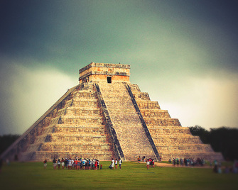
Lomo cameras are cheap and of low quality. This often causes unpredictable but interesting results that many have come to love.
blown highlights/ clipped shadows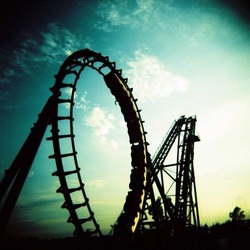
Film used in lomo cameras would produce blown-out highlights (pure white) and clipped shadows (pure black) due to the high contrast.
heavy vignetting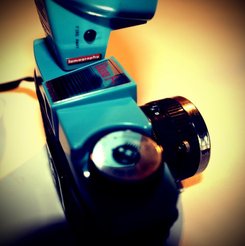
The cheap plastic lenses would also create heavy, dramatic vignettes- or a darkening around the edges of the photograph.
|
sharp center/ blurry edges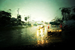
The cheap, plastic lenses would often create a very sharp area in the center of lomo images, and very blurry areas around the perimeter.
film grain
Film used would often have a noticeable grain to it, similar to noise created in digital images.
|
cross-process colors
Cross processing, or processing film with chemicals meant for a different type of film, would often produce interesting color effects.
increased saturation
The film used and lens would often create intensely saturated colors in lomo photographs.
|
Your assignment: edit two photographs you have taken in photoshop to give them the characteristic look of lomo photography.
|

|
|
photoshop instructions
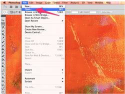
- File
- Open
- Find iPhoto image under Media>Photos
- Open
before we begin... crop to 10x8 or 8x10, 300 res.
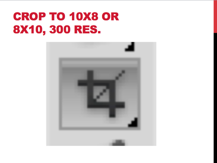
- crop tool
- 10x8 or 8x10
- 300 res.
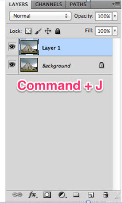
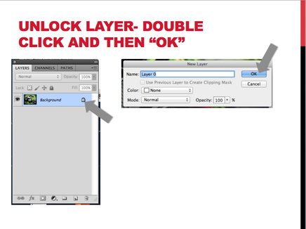
- Make copy of your background layer (original image)
- Use keyboard shortcut: Command and J
- Or drag and drop background layer on "New Layer" icon at the bottom of your Layers Panel (looks like a post-it note with the bottom corner folded up)
part 1: create vignette
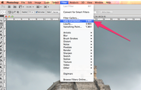
- Go to Filter
- Choose Lens Correction
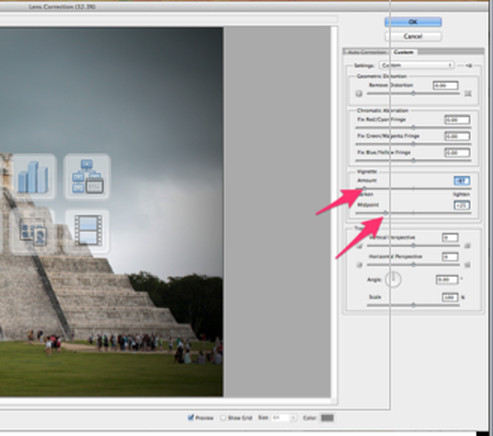
- Click Custom Tab
- Darken the Vignette Amount (to your liking)
- Adjust the Midpoint (to your liking)
- Click OK
part 2: blown highlights and clipped shadows
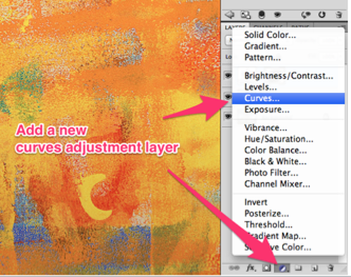
- Create a new CURVES ADJUSTMENT LAYER
- Do this by clicking the "New Adjustment Layer" icon at the bottom of your layers panel (looks like a circle that is half white, half black)
- Select "Curves"
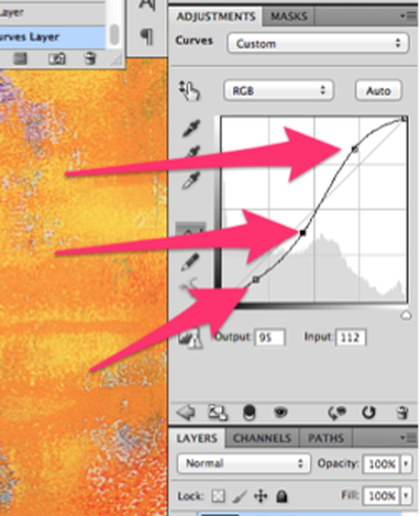
- Increase the contrast using the curves adjustment
- Click on a point of the diagonal line, towards the top. This represents the highlights, or lighter parts of your image. Move that point upward slightly to lighten the highlights.
- Click on a point of the diagonal line, towards the center. This represents the mid tones of your image. Move that point down slightly to darken mid tones, or move up slightly to lighten them (which ever looks better for your image)
- Click on a point of the diagonal line, towards the bottom. This represents the shadows or darker parts of your image. Move that point downward slightly to darken the shadows.
- Your line should now be in a subtle "S" shape.
part 3: cross-process color
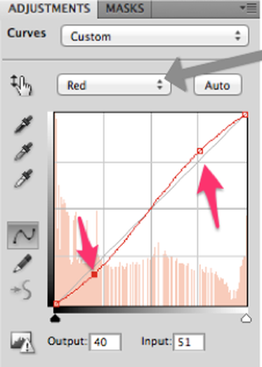
- While still in the "Curve Adjustment Layer" menu, select the drop down menu that says "RGB" in it.
- Select "Red"
- Increase the amount of red in the lighter areas of your photograph by clicking on a point towards the top of the diagonal line and move it upward slightly.
- Decrease the amount of red in the darker areas of your photograph by clicking on a point towards the bottom of the diagonal line and move it downward slightly.
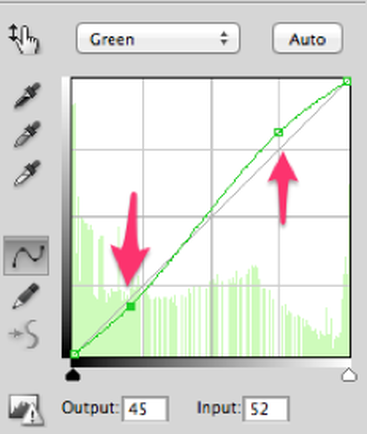
- Go back to the drop-down menu and select "Green"
- Increase the amount of green in the lighter areas of your photograph by clicking on a point towards the top of the diagonal line and move it upward slightly.
- Decrease the amount of green in the darker areas of your photograph by clicking on a point towards the bottom of the diagonal line and move it downward slightly.
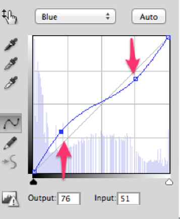
- Go back to the drop-down menu and select "Blue"
- THIS TIME, DO THE OPPOSITE!!!
- DECREASE the amount of blue in the lighter areas of your photograph by clicking on a point towards the top of the diagonal line and move it downward slightly.
- INCREASE the amount of blue in the darker areas of your photograph by clicking on a point towards the bottom of the diagonal line and move it upward slightly.
part 3: highly saturated color
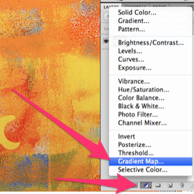
- Click the "New Adjustment Layer" button at the bottom of your layers panel.
- Select "Gradient Map"
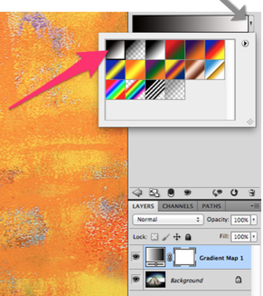
- Click the drop down menu next to the gradient, select the first option, black to white.
- Your image should appear black and white.
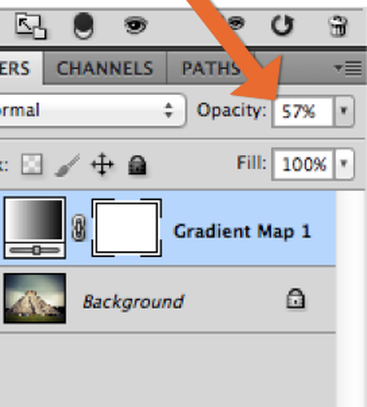
- At the top of your layers panel, turn the opacity down a bit to allow some of the color to show through (to your liking).
- Now you are going to boost the saturation in a select area of your image (I chose to boost the saturation just on the pyramid).
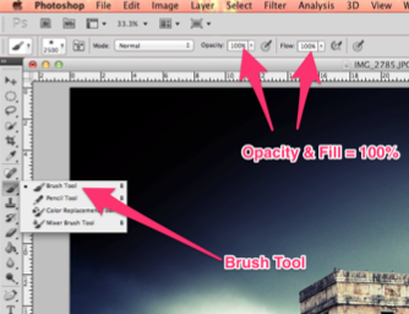
- Select your BRUSH tool.
- Make sure your Opacity and Flow is at 100%
- Select an appropriate brush size from your tool options bar.
- Use a SOFT EDGE brush.
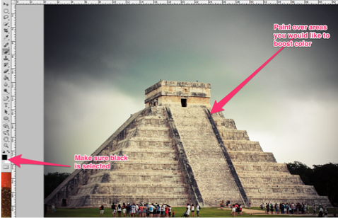
- Make sure you have BLACK selected (look to the bottom of your tool bar) It should be the square on top.
- Now paint on the area that you would like to be more saturated. (Where you paint is essentially erasing away or masking out the gradient map adjustment layer you just added, to let the photograph below show through)
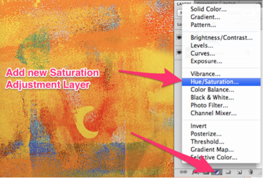
- Add a HUE/SATURATION ADJUSTMENT LAYER.
- Do this by clicking the "New adjustment layer" icon at the bottom of your layers panel.
- Then select Hue/Saturation.
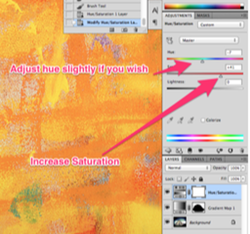
- Increase the Saturation to your liking by sliding the slider to the right.
- You may also adjust the hue slightly if you wish.
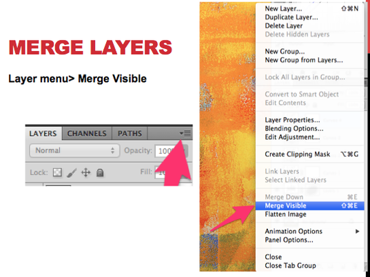
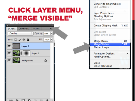
- Merge your separate layers into one layer.
- Do this by clicking on the "Layer Menu" icon in the top right-hand corner of the Layers Panel.
- Then, select "Merge Visible"
part 4: sharp center/blurry edges
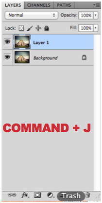
- MAke a copy of your background layer.
- Do this using the keyboard shortcut: Command and J
- Or Click, drag and drop the "Background Layer" onto the "New Layer" icon at the bottom of the layers panel (it looks like a square post it note with the bottom corner folded up)
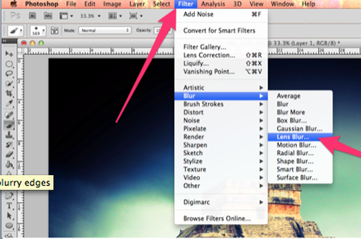
- Go to Filter (at the top)
- Select Blur
- Select "Lens Blur"
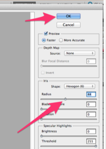
- Increase the Blur Radius to your liking (it should be pretty blurry!)
- I set mine to 44.
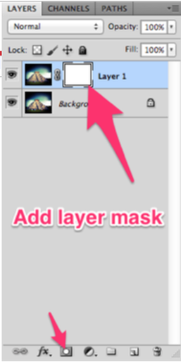
- Add a Layer Mask by clicking the icon at the bottom of the layers panel that looks like a rectangle with a white circle inside it.
- (This will allow you to "mask out" an area so that it won't be affected by the blur filter you just added, and will look clear)
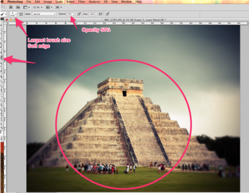
- Select your BRUSH tool.
- Use the LARGEST size brush.
- Use a SOFT EDGE.
- Change Opacity to 50%
- Click a few times in the center of your image, as you click your image should get clearer and clearer.
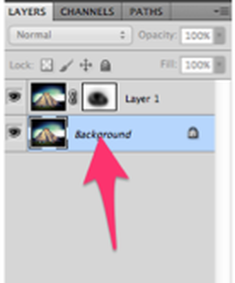
- Select your background layer by clicking it (it should highlight in blue)
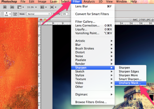
- Sharpen the background by clicking on FILTER
- Then select "Sharpen"
- Select "UNSHARP MASK"
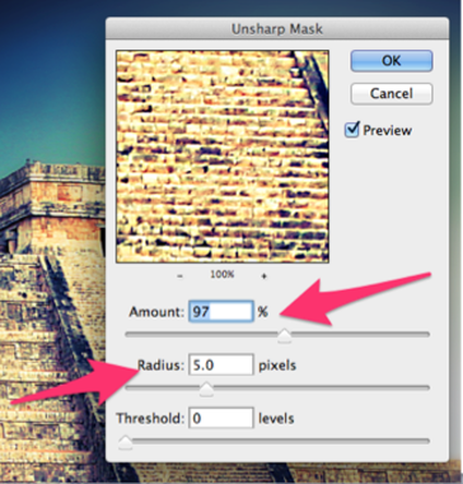
- Increase the AMOUNT. (I used around 97%)
- Increase the RADIUS. (I used around 5 pixels)
- Click OK.
step 6: film grain
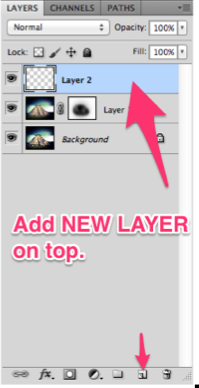
- Add new layer.
- Click the NEW LAYER button at the bottom of your layers panel.
- DRAG your new layer to the TOP of your layers panel.
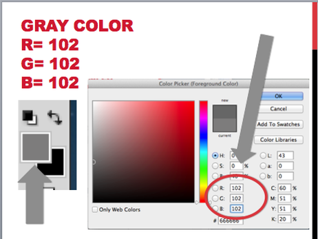
- Select a gray color.
- Double click on your TOP color box.
- Enter in the value 102 in the white boxes next to R, G and B to get a good gray tone.
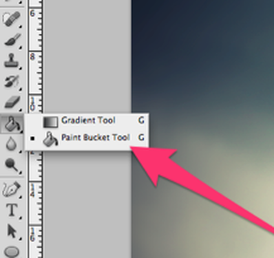
- Select your PAINT BUCKET tool
- Click anywhere on your image to paint the entire layer gray.
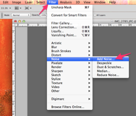
- Go to FILTER
- Select NOISE
- Select ADD NOISE...
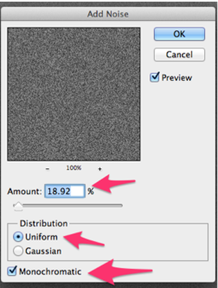
- Increase the amount to around 19%
- Make sure "Uniform" is selected under Distribution
- Make sure MONOCHROMATIC is selected at bottom
- Click OK.
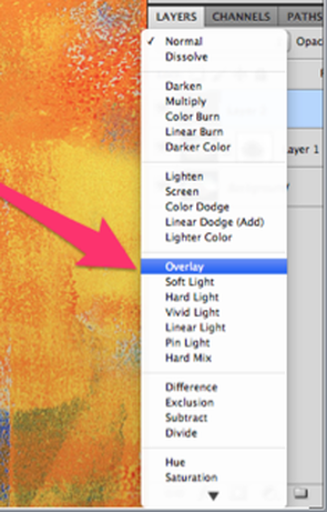
- Click on your Layer Blend Mode" Drop-down menu (it is found at the top-left of your layer panel, it should say "Normal"
- In the drop down menu, choose "OVERLAY"
- If the noise is still too strong, decrease your layer OPACITY (top-right corner of layer panel).
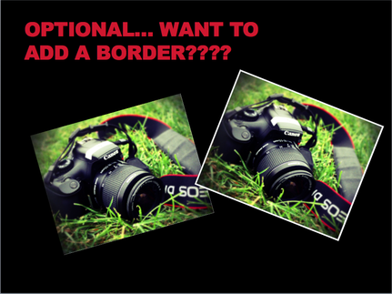
optional: would you like to add a border??
all done!!
- Now SAVE YOUR IMAGE.
- Go to File>Save to save it as a PSD (Photoshop Document)
- THEN, SAVE A SECOND TIME!!!!
- Go to File>SAVE AS
- CHANGE THE FORMAT FROM PSD TO JPEG
- Save.
- See schoology for upload and critique instructions.
